Case Study
UX/UI
Engineering
Team Lead
Prescription Card Redesign
A redesign of the core component patients use to review their medication and place an order — taken from a confusing pricing experience to a clear, single-select system shipped across multiple pharmacy brands.
Project Overview
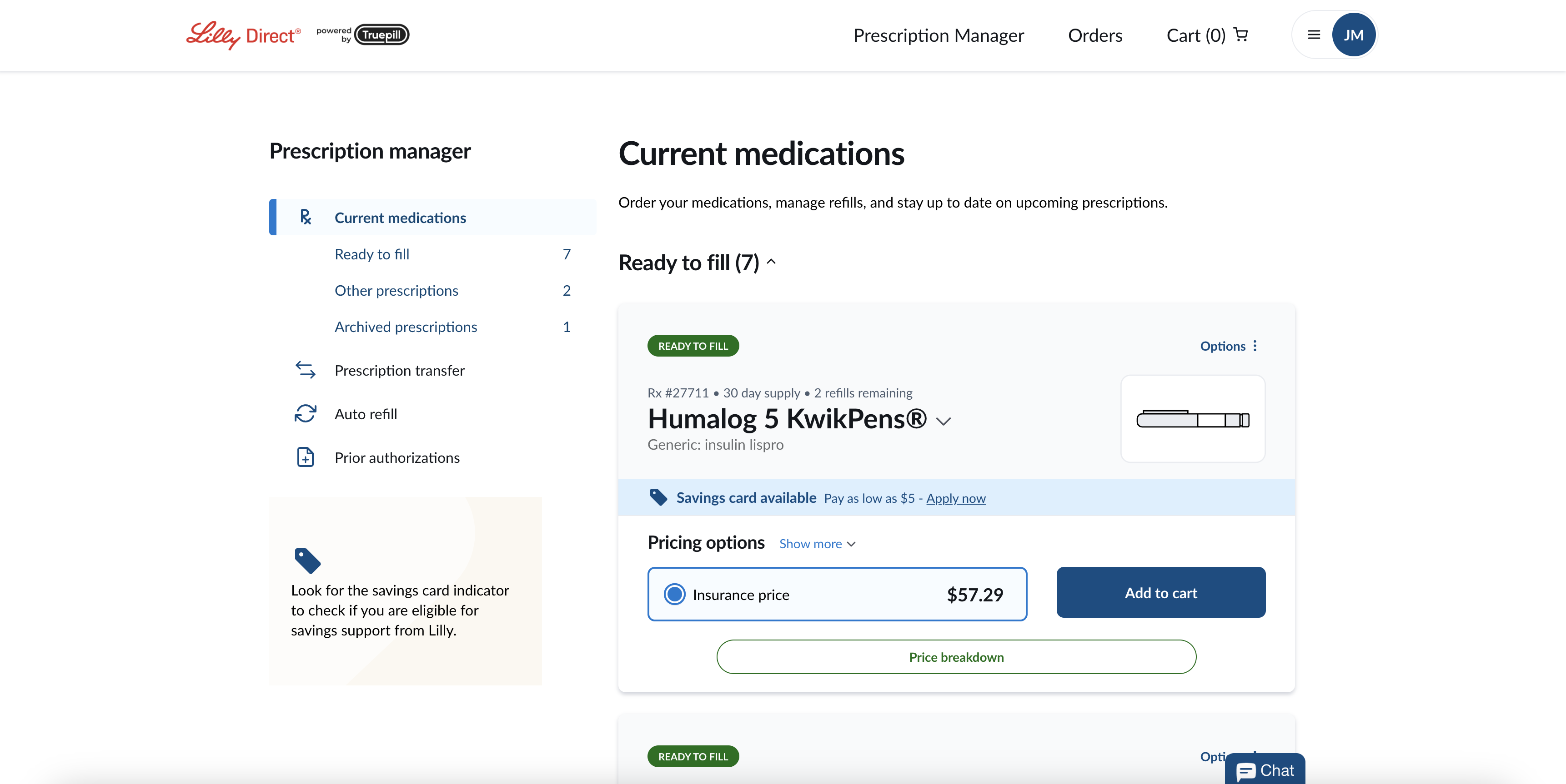
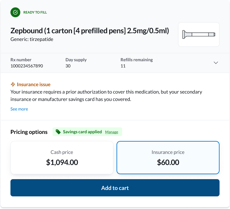
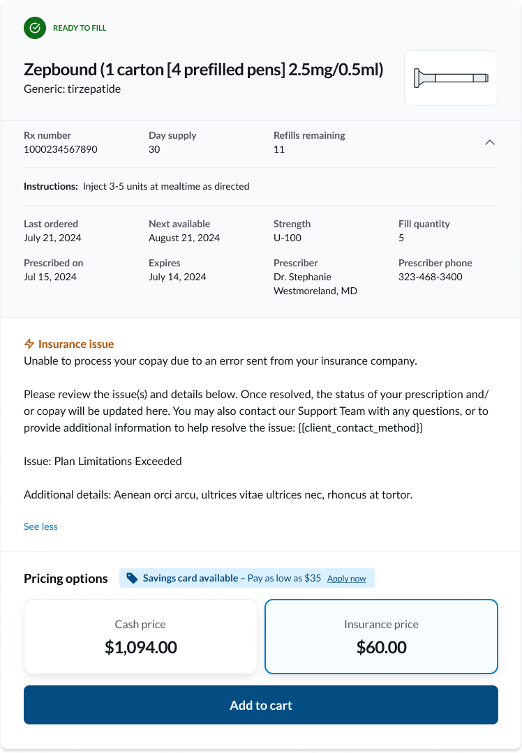
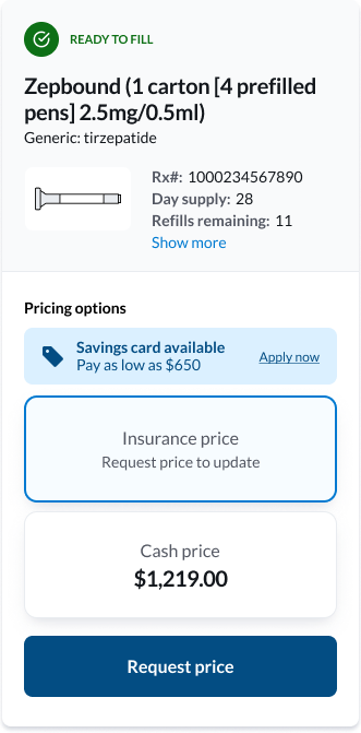
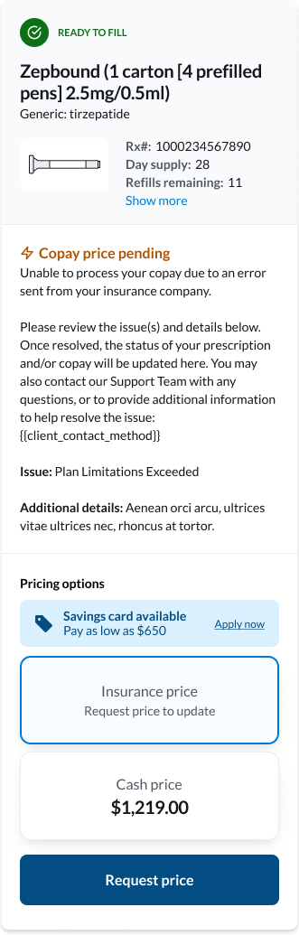
I led the redesign of the Prescription Card — the core UI component patients use to review their medication and place an order — within an online virtual pharmacy. The card needed to present essential details such as prescription name, status, RX number, refills, pricing options, savings information, and messages in a compact, mobile-friendly format.
I owned the initial redesign, iterating with a senior UX designer to refine information hierarchy, labeling, and mobile behavior. Once aligned, I translated the Figma designs into implementation-ready work by breaking the UI into React components, creating detailed engineering tickets with states and acceptance criteria, and leading a four-person team to build and document the components in Storybook.
The redesign was driven by recurring pain points uncovered through customer support feedback. Patients struggled to understand their pricing options, weren't always clear on how payment methods were applied, and frequently missed out on potential savings. These gaps created frustration, unnecessary support calls, and a lack of confidence in the ordering process.
Company
Truepill
Timeline
3 sprints - 6 weeks
Roles
Project Lead
UX Designer
Software Engineer
UX Designer
Software Engineer
Stack
Figma • React • TypeScript • Storybook
Team
1 senior UX designer & 3 software engineers
User Personas
Three patient archetypes informed every design decision — each one with different goals, tech comfort, and reasons for using a virtual pharmacy.
M
Marcus, 50
Freelance consultant
Lives paycheck to paycheck, uninsured, and very price sensitive.
Tech proficiency: Moderate
Goals
- Clearly see the lowest-cost option for his prescriptions
- Understand exactly what each price represents and how it's calculated
- Avoid "sticker shock" when unexpected prices appear
Pain Points
- Confused about why prices change between refills
- Doesn't always realize when a savings card is available
- Skeptical that the displayed price is the final cost
S
Sarah, 35
Software Engineer
Very comfortable with technology, expects efficiency and clarity.
Tech proficiency: High
Goals
- Quickly scan prescription details without extra clicks
- Compare insurance vs. retail pricing at a glance
- Refill from her phone during a busy workday
Pain Points
- Annoyed when critical information is hidden behind scrolling or unclear labels
- Doesn't want to call customer support for clarification
- Wants transparency about how pricing is generated
R
Robert, 73
Retired
Uses multiple medications; prefers phone or in-person but is trying an online pharmacy
Tech proficiency: Low
Goals
- Refill prescriptions without needing to call customer service
- Trust that the information shown is correct
- Keep the process simple and straightforward
Pain Points
- Low confidence navigating websites and mobile apps
- Gets overwhelmed by too much information on the screen
- Frustrated by scrolling and small text on mobile
Where We Started
Before the redesign, the prescription card tried to surface every piece of information at once. Pricing options sat side-by-side as equally weighted cards, which made the cash price (often dramatically higher than the insurance or savings price) the visual anchor of the entire component.The card also stretched vertically on mobile, especially when status messaging was present — meaning patients had to scroll past a wall of details before reaching the action they came to take.
Before • Desktop Collapsed
Before • Desktop Expanded
Before • Mobile Collapsed
Before • Mobile Expanded
Where We Started
Working with the senior UX designer, I translated support themes into eight concrete design principles — each tied to a real question a patient was asking, so we could measure whether the redesign answered it.
1
Provide patients choice in pricing (where applicable)
"What are all my options to make a purchase today?"
2
Clearly label pricing option methods (insurance, retail, etc.)
"For each of the options presented, how (specifically) will I be paying?"
3
Prevent confusion in how pricing is presented
"Where is this price coming from? How is pricing being generated?"
4
Minimize "sticker shock"
"Is that really the price? I cannot afford that!"
5
Encourage savings card enrollment
"Is there a way to save even more?"
6
Indicate when Savings Cards have been applied
"Has my Savings Card been applied, and is this the discounted price?"
7
Constrain height to reduce scrolling on mobile
"Why do I have to scroll up & down to see the information I need to make a purchase?"
8
Account for cash-only vs. insurance + cash pharmacies
"Wait, this pharmacy doesn't take insurance? Then what's the price?"